
In class on Monday we discussed online magazines and if other print magazines should convert to an online format. The example we used was an entirely online magazine called Lonny. I went to the website to check out the magazine and it read like a normal magazine would, just not manually turning pages. The quality of the pictures was unbelievable, it looked like I was reading a high definition magazine. This can definitely bring in more readers because it catches the eye. Two other magazines I saw were High Gloss and Rue, both online. They had similar themes, home decorating and life style, image heavy topics. I thought these magazines, including Lonny, focused more on pictures than on articles and stories. The magazines on newsstands also have predominantly images for content, but I feel that those have more writing and thoughts. I found an article from the New York Times about Lonny and other online magazines for further insight. When we took a survey in class of how many people would read an online publication, not many did. Even though we are in the age of technology, people still like being able to hold something and turn the pages. Lonny is an amazing magazine, people just have to prepare for the new age in magazine platforms.
Author: Becky N
Junior at the University of Missouri from Chicago, Illinois. Journalism major with a magazine editing emphasis and Spanish minor. Former Marching Mizzou color guard member.
“The Greatest Show on Earth: Fashion Circus.”
At the Stephen College Museum and Research Library there is an exhibit called “The Greatest Show on Earth: Fashion Circus. It is an exhibit that runs from September 10-December 15th 2011. This exhibit is located on the mezzanine level of Lela Raney Wood Hall on 6 N. College Ave, Columbia Mo. Elizabeth Hamman a sophomore at Stephens who is a fashion design major says that there is an,
“archive of 13,000 pieces downstairs, we pick a theme and bring out as many pieces as we can to fit that theme, a collection.”
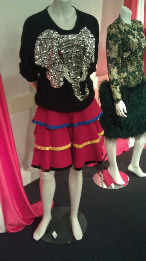
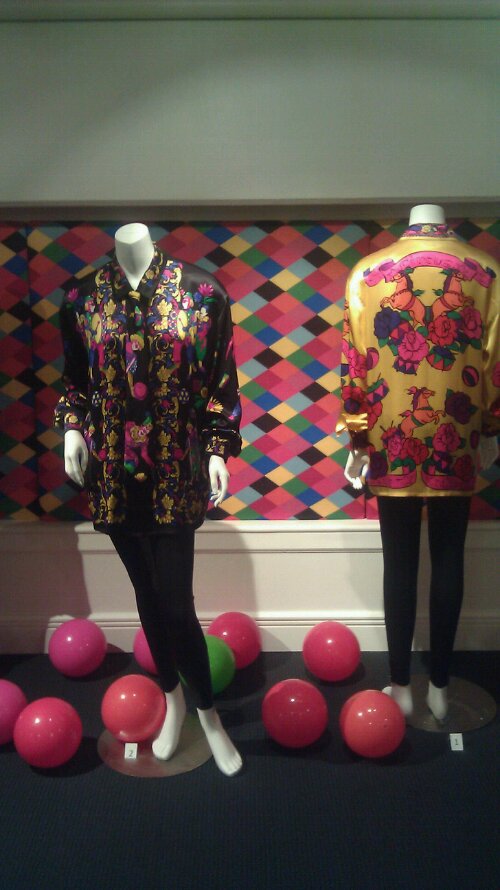
The curators, Jennifer Cole and Bradley Meinke, choose a theme every semester to put in the gallery for alumnus and students alike to view and appreciate. The archive consists of garments donated by alumnus and pieces that are collected for fashion students to reference for their studies. Last semester, they had a theme about business attire and next semester they are pitching an idea of a gallery inspired by art pieces. The two garments I chose in these pictures are from the exhibit. The first is a black sweater with sequined elephant applique. The designer is Oleg Cassini circa 1980. It has a red tiered skirt is designed by Fiorucci, donated by Nestor circa 1984. The other picture is a black circus print blouse with a tie, and a hot pink silk circus print blouse, designed by Escada, donated by Meinke.
Key Tips to Avoid Failure in a Design Blog
 In class we talked about how to make an efficient graph to get your readers to understand the point you are trying to get across. The speaker, Nathan Fleischmann, talked about how not to use the color red for an upward trend because people associate red with loss in business. The four steps of graphic design, Fleischmann said, was to research, edit, plot, and review. Therefore, research would imply using authoritative sources and to avoid bias. Edit would imply identifying your message and make sure you are getting what you want across. Plot is using a chart or graphic that your readers can understand to concise your topic. Review signifies checking your data from your sources, using your judgement on your graphic, and to look at your graphic from your reader’s perspective. I found an article entitled “Why Your Design Blog is Failing.” The three “secrets” they had were 1.) You must solve problems for your readers. The article talked about how having a “How To” article is helpful to readers. 2.) You must know who your target audience is. The article discussed how to make sure what you are blogging about pertains to your target audience, and who you want your target audience to be, whether it be clients or fellow designers. 3.) You must stay involved on your own blog. The article says to make sure you are staying involved with your readers such as tutorials and Q & A. If you stay involved, your audience will stay more involved. And finally, 4.) You must learn how to define success on your blog. In order to have success on a blog you have to make sure you have goals for the blog. Whether it be subscribers, views, replys, having other designers notice you, etc. If you have a set goal, you can see how successful you want to become and see your progress. These ideas are important and can help a person strive on the path to achievement in creating graphics and a blog.
Need for More Mobile News
 We learned in class on Monday that mobile apps are taking over long term leisure. Since people are always on the go, they check their phones for a quick joke, or a short headline about the news. In an article from the Project for Excellence in Journalism, “Just 13% of all mobile device owners report having an app that helps them get local information or news, which represents 11% of the total American adult population.” This means that many people are not getting their news on their phones because they don’t have time to read it. They also might not want to pay for these apps. “just 10% of adults who use mobile apps to connect to local news and information pay for those apps. This amounts to just 1% of all adults.” People want information that’s fast, concise, and cheap (perhaps free). News sources should consider this into their publishing and should perhaps create apps to appease the masses in order to create revenue for their companies.
Vox Magazine
 In class on Monday we discussed the different journalism emphases of our school, The University of Missouri. We had speakers who were in each department present, such as: Convergence, Broadcast, Strategic Communication, Photojournalism, and Magazine. The emphasis I want to go into is Magazine Editing, so it would only be suitable to discuss what our magazine program entails. Jan Colbert spoke about our program which included the use of iPads, essential reporting, and time consuming stories. She also talked about the Columbia city magazine Vox. Vox started in 1998 where their two weekly newspapers, one about entertainment, the other the Sunday magazine, combined to make one cohesive magazine about the small city life of Columbia. Incorporating culture, music, art, events, and trends to help give the readers enough information to be “in the know” of what is happening in Columbia. Here is their mission statement below:
“Vox blends Columbia’s urban mentality and hometown familiarity into a smart, small-city tabloid. We profile the human condition, expose local culture and provide reviews, tips and trends that tell our readers what’s happening and where to be. Every week we keep an ear to the underground and an eye out for the unique to bring you an analysis and reflection of contemporary issues. Vox is something new, something useful, something provocative” (Vox Magazine).
Sarah Hill “Sarah’s Stories” and Google +
On Monday there wa s a presentation about “Sarah’s Stories” on U_News on KOMU. Sarah Hill is a newscaster on KOMU and uses Google +, Facebook, and Twitter to communicate with the audience simultaneously with the newscast at 4pm. She talked to viewers on Google + during the broadcast, and she was able to get context to what the viewers think about today’s topics. Related to my last post about the St. Louis Beacon, both of these news sources are incorporating direct audience feedback in their news. Since the news is directed to a certain audience, getting opinions from that audience will enhance the story and let the newscasters/writers know what their viewers/readers want. This is a revolutionary idea and should, hopefully, give other news stations the incentive to use this idea to get a better glimpse on their audience’s desires. Here is a video about “Sarah’s Stories” and how she weaves audience interaction with the normal afternoon newscast seamlessly.
Margie Freivogel and the St. Louis Beacon
![]()
On Monday October 3rd, Margie Freivogel, the founding editor of the St. Louis Beacon presented the online newspaper to our class. Freivogel used to work at the St. Louis Post Dispatch before she started the St. Louis Beacon, which really shows her credibility as a journalist. She received many rewards for her work on News Watch in Washington D.C. for the Post Dispatch. The St. Louis Beacon is a non profit organization whose main goals are high quality journalism, engagement, and connecting with the community in St. Louis. She talked about being drastically independent, presenting context and important issues, and the passion for journalism. She also said they needed people who were experts in business and technology because the journalists should focus on the stories. The Beacon did a series called “Race Frankly” that discussed racial issues and opinions of people in the St. Louis Community. They had barroom conversations with citizens of the community that was loosely led by a member of the Beacon. There are 20 staff members, 15 are journalists, which makes it a more intimate atmosphere for a paper. 65% of their revenue comes from generous donations, 20% from foundations, and the rest is from events. Freivogel said the key difference in the Beacon and the Post Dispatch was the journalistic reforming, which was easier to do with the Beacon because it is a smaller organization with no limits or expectations. She said that they can seize opportunities as a new organization so they can experiment. Seeing the presentation was inspiring to see that an online newspaper can start from the ground up with the framework of the opinions and ideas of the community that reads and donates to the paper itself.
Interesting Story, Terrible Coverage

I stumbled upon a story on CNN about French companies putting mosaics of Post-it notes on their office windows, called the “Post-it Wars.” It seemed like a good story in theory, but the coverage was terrible. The camera was shaky, constantly zooming in and out, and was not always in focus. There were good interviews used but the quality was very poor. Some of the interviews didn’t have good lighting, sound, or good angles. One of them was shot outside, in which you could hear the sounds of cars, wind, and the city. The final closing shot, was once again, a good idea in theory, but terrible execution. The last shot was of the reporter putting Post-it notes on the wall himself while panning out to the rest of the window. All of the zooming at panning made me feel dizzy and disoriented, which isn’t how I should be feeling about a news cast. The story was reported in a foreign country, and I feel that showing us their culture and creativity is very good, but when the whole story is about images on the wall, you would think the cameraman would make the video high quality. I was interested in clicking the link to the story, but I was very disappointed in how the story was reported.
Photoshop Gone Too Far
 We discussed in class about how sometimes using Photoshop extensively alters pictures that make them too different from the true image. There is nothing wrong with doing this if it is purely recreational and is not used commercially. If the image is used commercially, you can be selling a fake product, but more importantly, if used in magazines or news stories, it can make the image a fabrication of what actually happened. I found a website that shows many well known exaggerated Photoshop edits from popular magazines that many people have been offended by. Another problem with exaggerated editing is if it is a person, the person can be so altered that they are unrecognizable. The models in these photos can be really offended if they see themselves on the cover 20 lbs lighter or with a thinner face. The last problem with over extensive use of Photoshop is that the public thinks that good looks are represented by the people in the magazines, fake and totally Photoshopped. This can give people lower self confidence and have many insecurity problems later in life. Once again, I am not banning the use of Photoshop, I think it is a great program, I just believe that it should be used to edit an image that is already there, not fabricate a new one out of an old image.
Training for Life Campus
![]() For my semester project for J2150, my topic is the new Training for Life Campus in Columbia, Mo. for the Special Olympics. I picked this topic idea because this will be the first official place in Columbia for children and adult participators in this amazing program to have an area to practice and feel at home. I picked an article from the Columbia Missourian that discusses it briefly. It says in this article that Gary Pinkel, one of the co-chairmen of Special Olympics Missouri and the head coach for Mizzou football, proudly advocates the new center. He also has a personal connection with the organization because both his brother and sister have a hereditary disorder that makes them confined to a wheelchair. This new center will benefit disabled and special needs children and adults in the central Missouri area. Having this $7.5 million center will give them a sense of permanence and will indeed make them feel even more special then they already are.
For my semester project for J2150, my topic is the new Training for Life Campus in Columbia, Mo. for the Special Olympics. I picked this topic idea because this will be the first official place in Columbia for children and adult participators in this amazing program to have an area to practice and feel at home. I picked an article from the Columbia Missourian that discusses it briefly. It says in this article that Gary Pinkel, one of the co-chairmen of Special Olympics Missouri and the head coach for Mizzou football, proudly advocates the new center. He also has a personal connection with the organization because both his brother and sister have a hereditary disorder that makes them confined to a wheelchair. This new center will benefit disabled and special needs children and adults in the central Missouri area. Having this $7.5 million center will give them a sense of permanence and will indeed make them feel even more special then they already are.
